When we look directly at the sun we are momentarily blinded by its glare. This is not dissimilar to the effect of fluorescent colour on our eye’s retina. Fluorescent colours thrust us into a feeling state, where sensations override all other modes of functioning. They are visually confronting, demanding ontological affirmation, as if to say: “I exist”. Perhaps this interest in fluorescent colours speaks of our innate need in humanity for confirmation, dare we get lost in the abyss of mass mediocrity.
Fluorescent colours jolt us into reality, daring us to take notice of the world around us or at least look at it with fresh eyes…
It is easy to attribute fluorescent colours to human invention, yet it is the natural world to which we should look to for their source. Fluorescent colours are present in naturally occurring phenomena such as the aurora borealis (the Northern Lights); certain tropical fish possess fluorescent properties, as do diamonds. The artists in Fluoresce II are not the first to use fluorescence for visual communication either – it was recently discovered that shrimp use fluorescent colour to attract sexual partners, as do budgerigars.
Fluorescence is also used as an attractant in contemporary society: it is present in highlighters, post-it notes, and nightclub tattoos. This is because fluorescent colours reveal both the visible and the invisible bands of the spectrum, making them reflect up to 300 per cent more than non-fluorescent colour. They are also seen 75 per cent sooner than conventional colour. Hence, fluorescent communication heightens optical experience and our perception of colour. The artists in Fluoresce II exploit this understanding- they manipulate their chosen medium to arrest our senses into a state of wonder and contemplation.
Fluorescent colours have a history with trends and craft making. Rachel Jessie-Rae O’Connor relies on commonplace craft materials such as glitter glue and fabric paint to provide the tools for making artwork. With the craftsmanship similar to that of a cake decorator, she manipulates glitter-glue into intricate patterning. Her desire for sparkling art is coupled with an interest in design. The works become mandalas not unlike Buddhist paintings. However, rather than promising the heavenly qualities of nirvana or enlightenment, these glitter-glue pieces promise the consumable accessibility of today’s craft project.
Craft and occupational drawing/design provide Helen Neville with a platform for inquiry as she focuses on legitimising these disciplines within Fine Art discourse. She utilises her research in mass arts such as tattooing, illustration and make-up artistry, and combines it with her developed understanding of drawing to create highly stylised works. The fluorescence of her life-drawings is highlighted by the use of common media such as ballpoint pens and textas. The appeal of her work lies in its ties to advertising art, pop culture and the flat two dimensionality of the picture surface.
Fluorescent colour radiates through tiny perforations in Sally Richmond’s work. A rectangular sculptural form houses optical effects within a synthetic and three-dimensional visual field. With the repetitiveness that echoes of pointillism, each perforation becomes a distinct component of the whole to which it belongs. Light becomes content. It is a closed unit, physically inaccessible but malleable under the weight and active engagement of visual perception.
Visual perception is paramount in the work of Wendy Dracoulis where digitilised grids disintegrate in time and space. The moving images fragment and regenerate into new configurations. The two projections effectively create a large spatial arena where the viewer may be absorbed into a plastic, digitilised world. Each projection marks out infinite possibilities for line, colour and form.
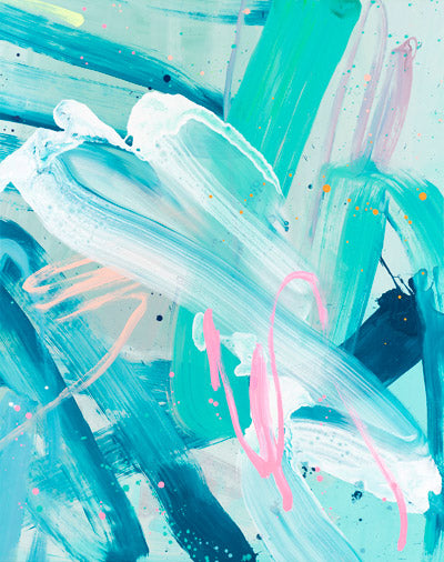
Arite Batzogiannis captures the translucent quality of fluorescent colours. This, when combined with a traditional palette, evokes the natural world but with a foreboding sense of the artificial. Arite’s paintings, though static, shift and move through the viewer’s gaze. Each brushstroke plays and dances with one another as though stasis is not a constituent of the painted surface. The forest of gestural marks scramble for recognition, the quality and tonal breadth of each colour attempts to outweigh the next. It is a living, breathing battleground for chromatic- preservation.
Rowena Martinich engages with the periphery of the gallery space, creating a dialogue with the unexpected. Expanding the traditional parameters of a “gallery-space”, she has painted onto the wall of the stairwell that leads to the gallery. It is the in-between spaces that we often neglect. Rowena draws our attention to the tensions inherent in spatiality and the nature of “seeing”. Her chaotic painted marks are controlled by the application of geometric shapes using tape. The tape becomes a framing mechanism, giving structure to an otherwise loose and uninhibited display of fluorescent expression.
Lucy Lincoln’s methodology for art making is unique. She creates dioramas on the top of a light projector, and then documents these interventions using macro-photography. What results is at once confounding and awe-inspiring. The images are imbued with an other-worldliness- they appear as vast lunar landscapes but simultaneously exist as micro-scientific probings into molecular structures. It is this inability to pinpoint the content of the images that arrests the viewer into a permanent state of perplexity.
The natural world is the source of inspiration for Rebecca Odgers. Fluorescent forms climb the gallery wall in Infinite III. The “III” in the title alludes to a history – this installation being its third incarnation. Previous installations include Hackney City Farm in central London and Melbourne’s Gasworks Arts Park. In all three settings the perspex forms are illuminated by the play of light. Fluorescent colours enhance the luminescent qualities that already exist in her work. The plant-like forms have a supernatural and luminative glow and speak of hybridisation between the natural world and a world consumed by the potential of technology.
Public space is also fertile ground for exploration for Louise Kellerman. She creates paths in public spaces. The documentation of these pathways is in the form of postcards and reveals an interest in trajectory and travel. Emboldened with fluorescent colours, the paths speak of the artificial. It is within the imposed limits of pathways that we are controlled within a given space. Kellerman highlights our blind acceptance of these controlling agents. She also offers an alternative by delineating new pathways to travel over, across, or through. The fluorescent pathways evoke a sense of timelessness, they exist as fleeting potentials yet to be experienced.
In John Gage’s seminal work Colour and Meaning (1999) there is no mention of fluorescent colour – its meaning today seems to be inextricably linked to kitsch, pop and urbanity. Its application heralds the revival of the 1980s: hula-hoops, bracelets, spokey-dokeys and neon lights. For cyclists, it is the means for asserting one’s presence on the road. Yet it is the luminescent qualities of fluoresce that appeals to today’s artists rather than a yearning for a direct reference to this bygone era.
As the artists in Fluoresce engage with the visual potential of fluorescent colour the viewer begins to question the function of colour and its effect on our perception. Whilst fluorescence is the binding agent for the artists in Fluoresce it is by no means the exclusive content of their work. Their interest in fluorescence does not yield a quantifiable meaning, nor does it consolidate a unifying vision of colour perception, it simply allows for a phenomenological survey of our own associations to this unique spectrum and should you suffer from a bout of chromophobia, there will be no relief.
CLAIRE WATSON
Claire Watson is a Melbourne-based artist, curator and writer.
Follow Us On Social